

Portfolio of Suvo Ray
Design, Art, Type and everything in between

When customers change the screen size, the keyboard navigation behavior changes at different breakpoints. This became even more complex as we had to manage focus shifts across these breakpoints. This challenge led us to design the keyboarding framework specifically for reflow.
In Microsoft Teams, we follow three principles for accessibility:
Efficient: Ensuring the interface is quick and easy to navigate.
Predictable: Maintaining consistency in the user experience to build muscle memory.
Clear: Providing a straightforward and understandable interface.
While designing, we considered two approaches:
1. Keep the keyboarding behaviour the same across all breakpoints.
2. Focus the keyboard on what is currently visible.
We ultimately selected approach 2. If you’re interested, I’ve included a few screens illustrating approach 1 at the end of this study.
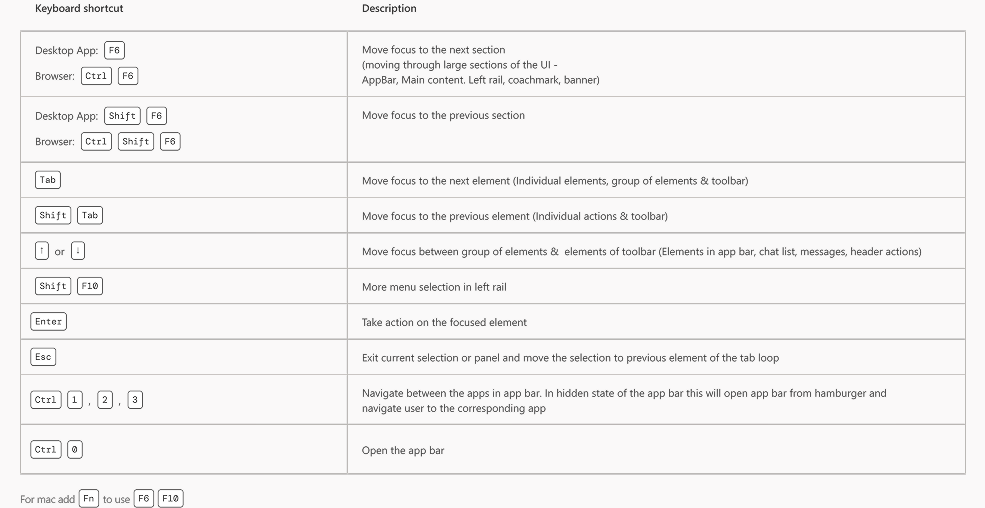
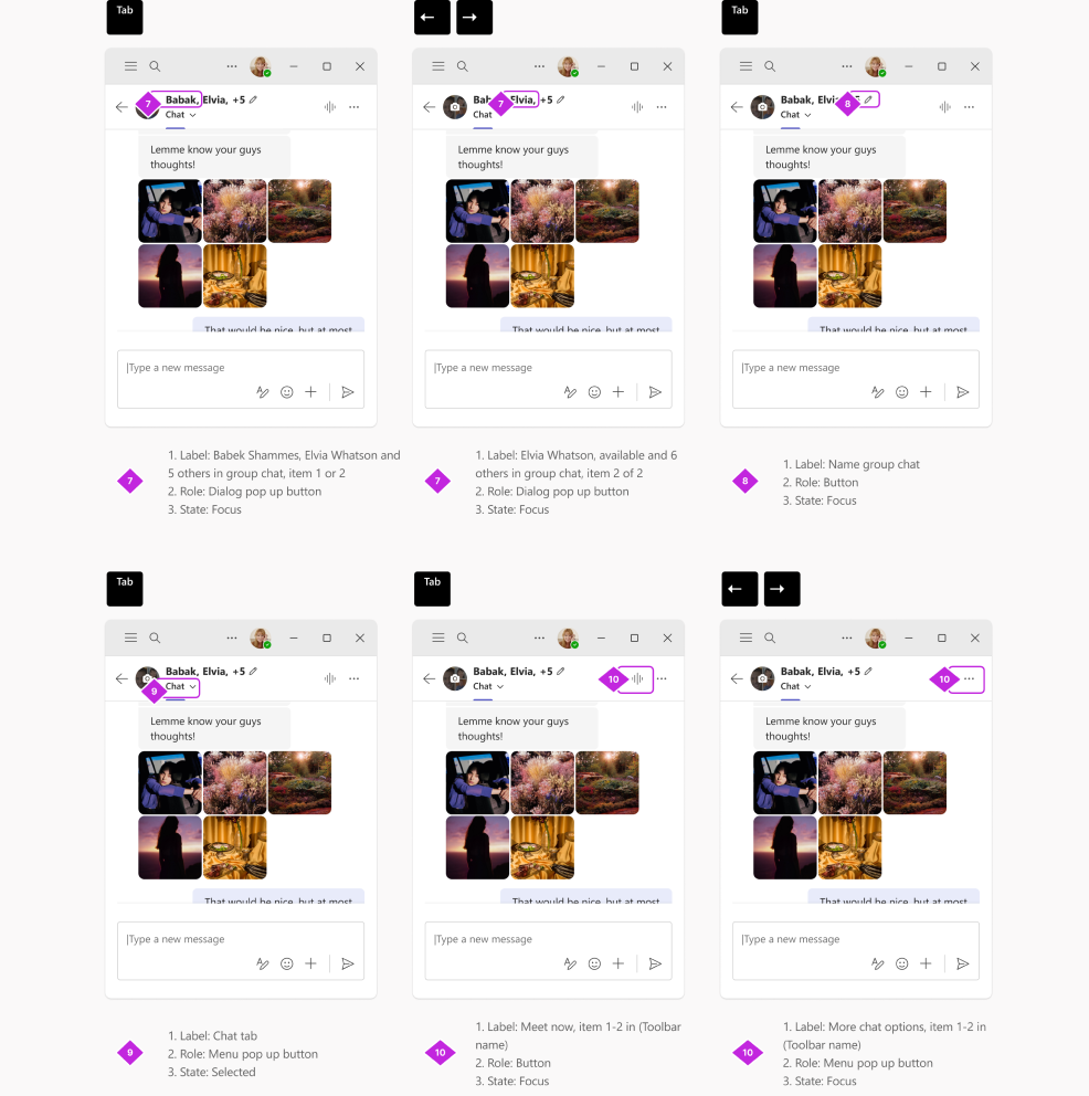
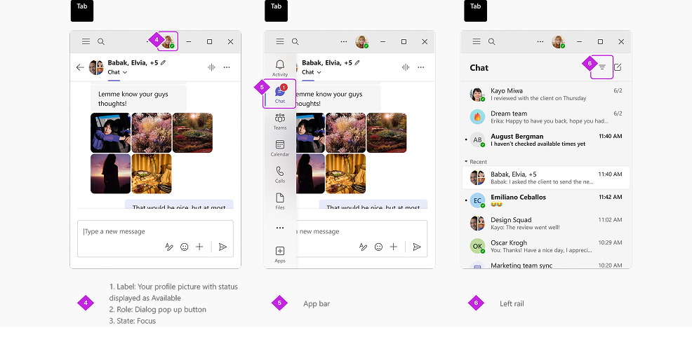
Navigational keyboard shortcuts help you use Teams in the desktop app or web browser without needing a mouse. Below is a list of supported accessibility shortcuts. Elements in focus have a colored outline and a number, as shown here:
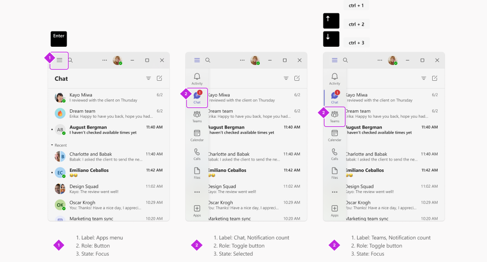
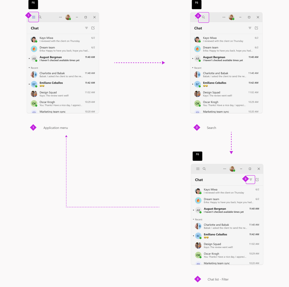
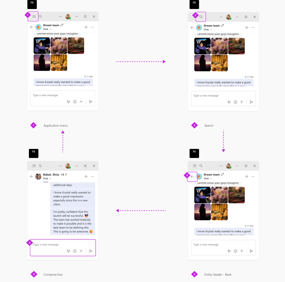
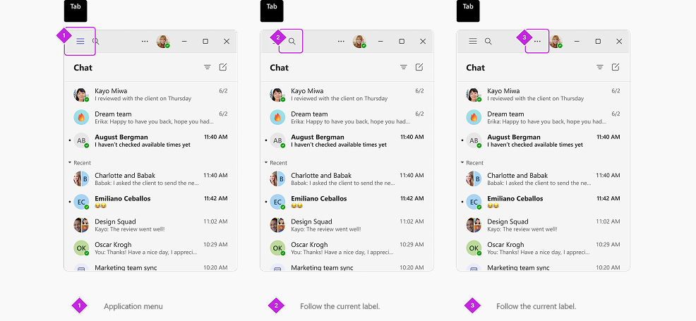
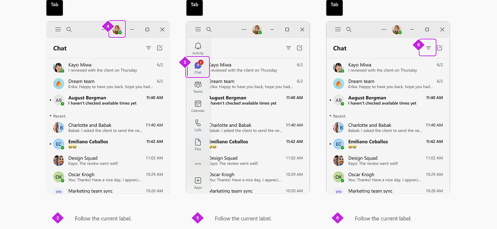
The application menu helps customers navigate through different apps at smaller window sizes. It can be accessed via the hamburger menu in the title bar. All keyboard shortcuts for the app bar remain functional when the app bar is collapsed. Pressing Ctrl + [number] will take users directly to the corresponding app.
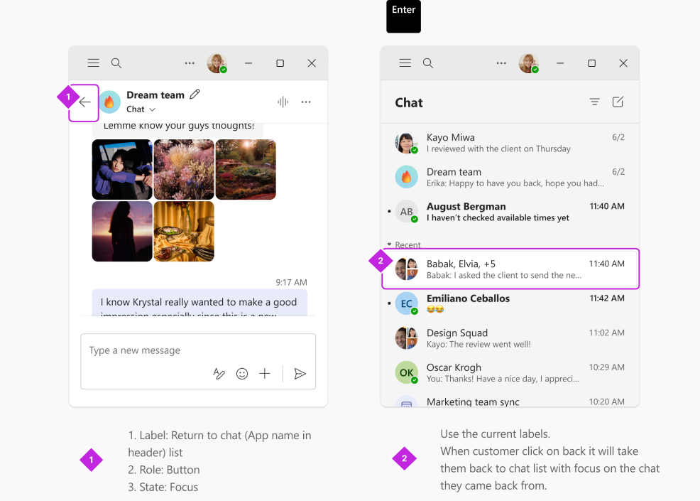
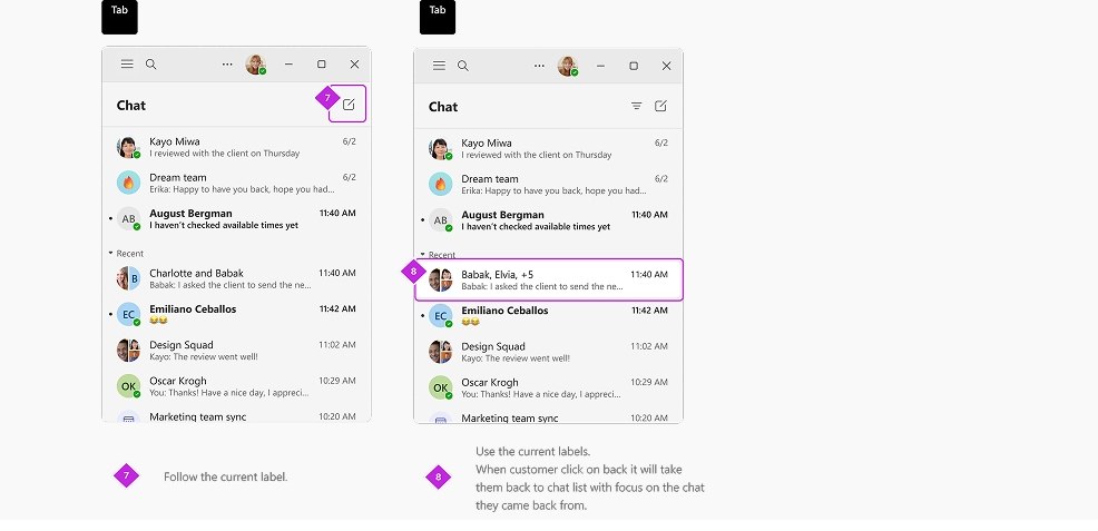
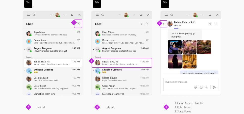
The back button allows customers to navigate between Level 2 (L2) and Level 1 (L1). When going back from L2, the focus should land on the selected chat in the chat list.
Contextual panes can be accessed through the More menu in the chat header. When a customer opens this menu, the focus should land on the first actionable element.
F6: Move focus to the next section when navigating through major UI areas such as the AppBar, Main Content, Left Rail, Coachmark, and Banner.
F6: Move focus to the next section (navigating through major UI areas such as the AppBar, Main Content, Left Rail, Coachmark, and Banner).
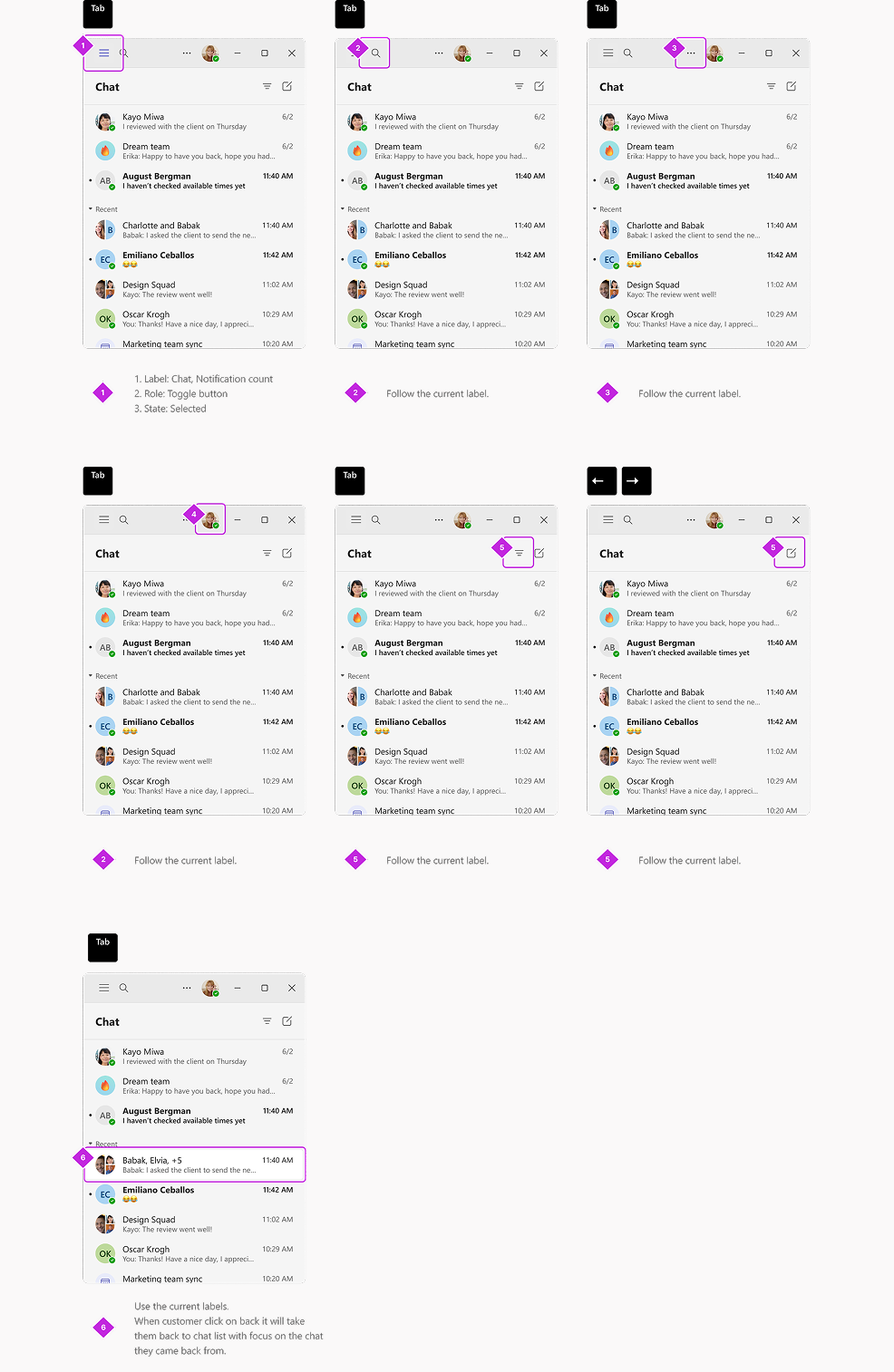
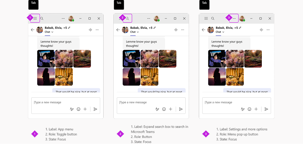
The following is the tab order for Level 1 (L1) of chat or channel. What we developed here has become the standard keyboarding convention for all WXP apps.
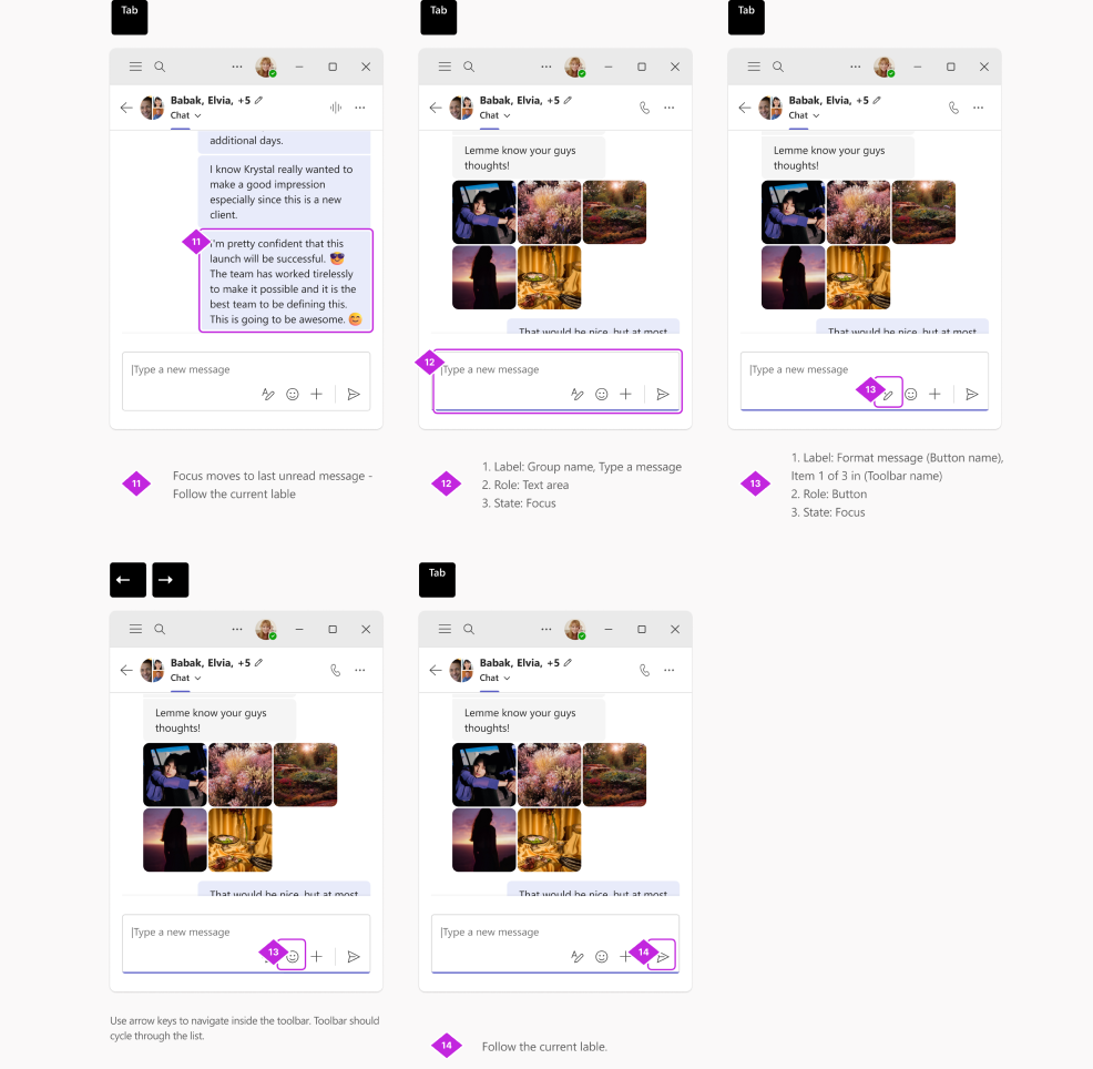
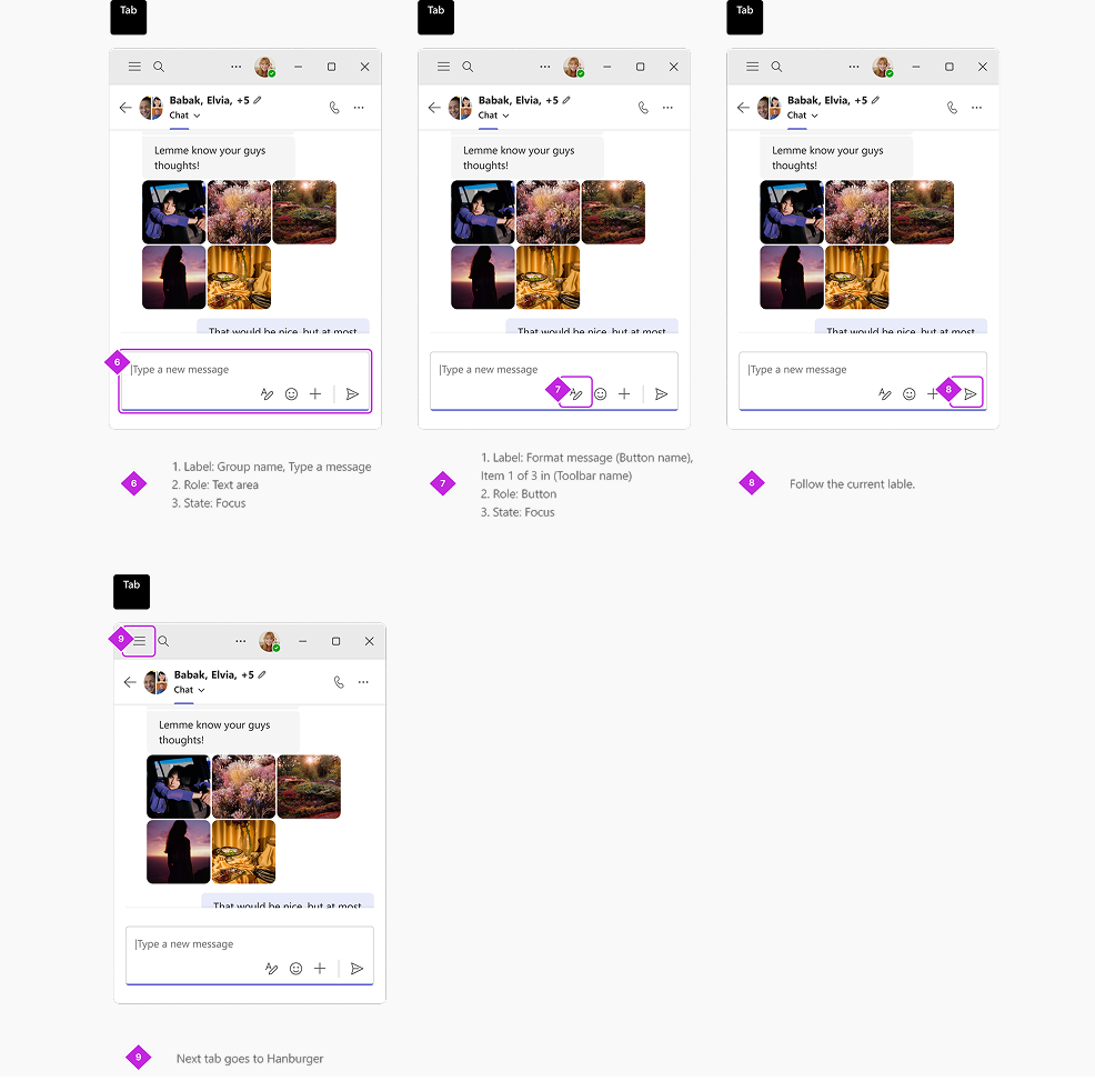
This second set of screens illustrates the tab navigation within the chat stream.
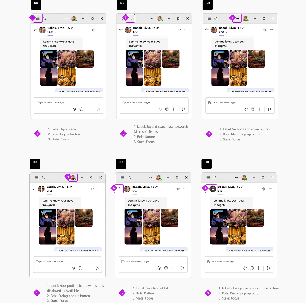
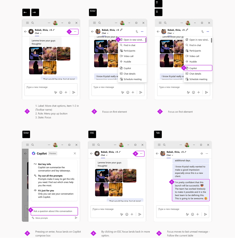
This set of screens shows the tab navigation from the compose area to the end slots.
This was one of the approaches considered by the PMs, but once the design team got involved, we recommended a different approach — the one you saw earlier.
Let’s take a look at Approach 1 and why it was not preferred by design. This approach primarily keeps the tab order the same across all screen sizes. This means that even if an element is hidden on smaller screens, it would still be included in the tab order.
The rationale behind this approach was that PMs believed it would benefit visually challenged customers, as they could memorize a consistent tab order.
However, after testing both approaches with visually challenged and typical users, we decided to adopt the second approach (the one focused on visible elements only).
On average, 23% of users resize their Teams window below 720px, and 19% resize it below 640px. Microsoft Teams is currently used by more than 320 million people worldwide. Adoption of reflow is steadily increasing as users take advantage of snap layouts and multitasking with reflow enabled in Teams.
The keyboarding specification we developed for chat and channel has become the standard for all WXP apps.
Design: Suvo Ray
Design lead: Daisy Geng, Vivian Hsu
PM: Brett Humphrey
Engineer: Alycia Bhargava, Don Wise, Rohit Pagariya


